PORTA-RETRATO

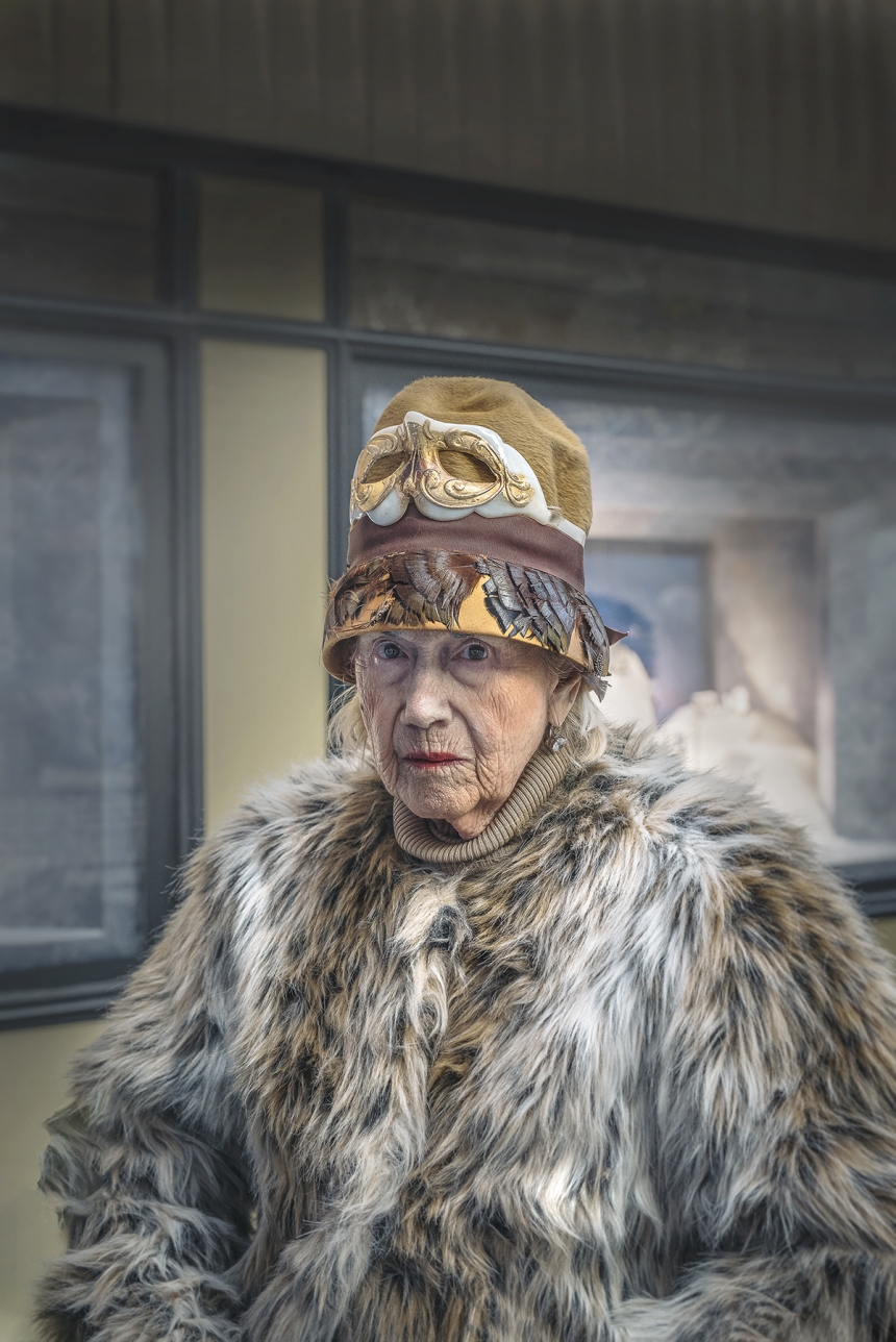
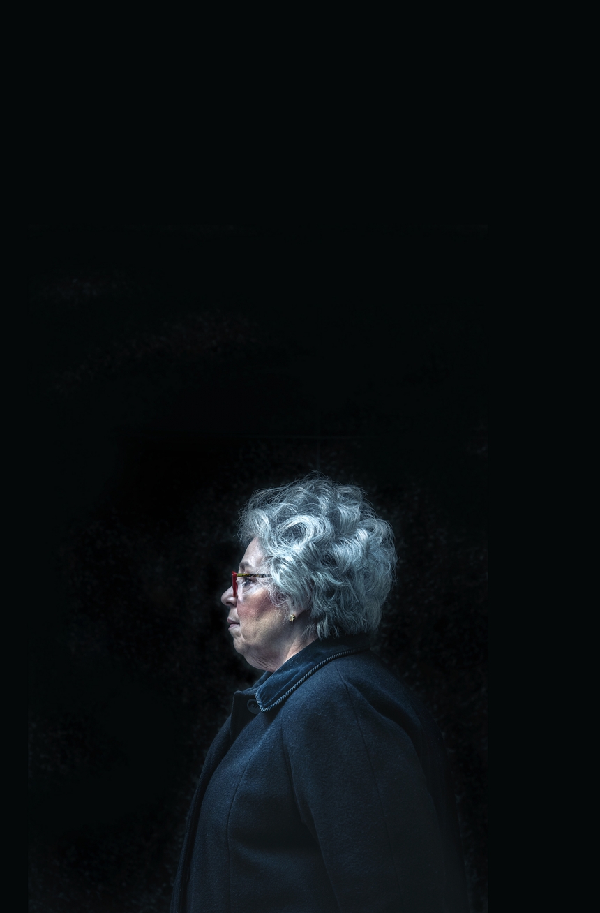
i'm all wrapped up in this stunning series of photos from new york street photographer daniel featherstone. 

it's all about eccentric characters that capture his attention, in a city that continues to capture everyone's attention.

from featherstone: "Such a mix of transient diversity from the plastic surgery nobility to paraplegics to overwhelmed, zombie-like tourists. Every person I shoot is never staged, they are completely candid, I wouldn't have it any other way. The naturalness is what gives us all this common thread of knowing."

New York street photographer Daniel Featherstone

via creative boom

SWIM SWIM SWIM

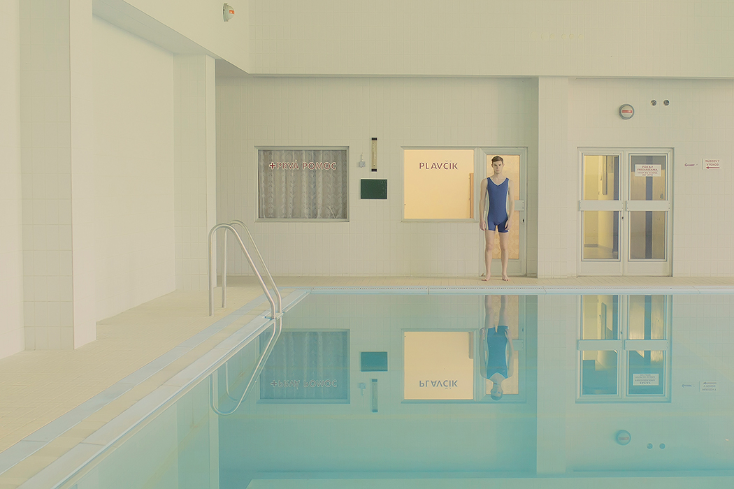
VERY into these pastel swimming scenes by slovakian photographer maria svarbova.

i am usually more drawn to work with more movement, but these surreal and kinda robotic scenes feel cinematic and beautiful. obsessed with the first one.

Maria Svarbova
Maria Svarbova
Maria Svarbova
Maria Svarbova
Maria Svarbova
Maria Svarbova

more here. and here.

via ignant

HEARTSTAGRAMS

i usually use this space to share the work of artists i love. today, i'm mixing it up a little and sharing something i worked on and love!

we shots tons of gorgeous photos for our hearstagram campaign this year at framebridge. some product, some lifestyle, all really bright and fun. we worked with artist kathryn zaremba and photographer laura metzler and came up with a couple of fun set ups. this one is my favorite. it's everything hearstagrams should be: playful, pretty, kind of a wink, good all year round... but extra perfect as a new kind of valentine.

Collection of Kisses by Kathryn Zaremba

PAINTED FANTASY

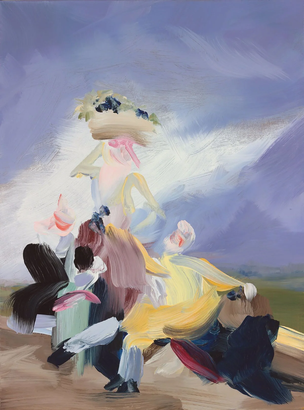
the work of elise ansel is complex and beautiful, light in touch and heavy in meaning. we've all seen artists re-interpret old pieces of art and move them to abstraction, but these struck a special chord with me. the people become almost ghost-like, like some sort of memory. it feels kind of sad for some reason, but really beautiful.

from the artist:

"My paintings are about re-creating, re-visioning, and re-presenting paintings that were created at a time when women were seen as objects... My paintings begin with a specific pictorial point of departure but then move towards abstraction as the representational content is balanced by focus upon color, composition and the materiality of the paint... The real subject becomes the substance and surface of oil paint, the variety of its applications, and the ways in which it can be used to celebrate life."

Elise Ansel
Elise Ansel
Elise Ansel
Elise Ansel
Elise Ansel
Elise Ansel
Elise Ansel

more here.

via miss moss

IN THE STUDIO

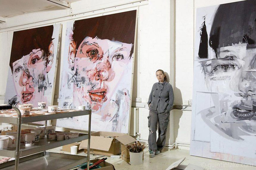
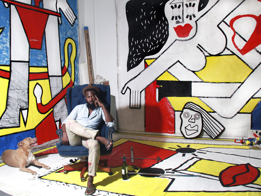
came across this beautiful collection of photos showcasing famous artists in their studios. love seeing the connections between the work style and the studio. so interesting to think about what spaces people find the most conducive to their creative process.

Claude Monet

Claude Monet

Laurie Lipton

Laurie Lipton

Pablo Picasso

Pablo Picasso

Francis Bacon

Francis Bacon

Hans Hartung

Hans Hartung

Alexander Calder

Alexander Calder

Jenny Saville

Jenny Saville

Chris Ofili

Chris Ofili

Fernando Botero

Fernando Botero

Mr Paul

Mr Paul

more here (there are one hundred!)

FACE TO FACE

i really loved going through this collection from viktor & rolf for spring-summer 2016. we have all seen work inspired by cubist picasso a million times, but this one felt kind of different and fresh to me. i love the progression of the pieces and that the starting point is a little white dress. each piece stretches the reference a bit further, making the models less and less visible and increasingly more of a vehicle for these moving sculptures they've created.

the other interesting thing is that cubism is inherently not about "pretty." it's about asymmetry (which the eye often finds confusing AKA ugly) and disrupting the peace by breaking up the pieces and throwing them around. the cool thing about this interpretation, however, is that it feels light and really beautiful.

Viktor & Rolf
Viktor & Rolf
Viktor & Rolf
Viktor & Rolf
Viktor & Rolf
Viktor & Rolf
Viktor & Rolf
Viktor & Rolf
Viktor & Rolf

via wwd

PAPYRUS ROCK

holy exacto knife. meet artist - and, i think, scientist at heart - rogan brown.

brown takes inspiration from biology and creates beautiful representations of the intricate and incredible patterns and prints that happen organically in nature. also, this is all made out of paper. completely incredible.

from rogan: "My work plays with the architecture of nature and organic growth. By identifying patterns and motifs that occur in the natural world in different contexts and at different scales, both macroscopic and microscopic, I have developed a formal, aesthetic vocabulary that I use to construct hybrid sculptural forms, half real, half surreal."

more here.

via the jealous curator

NYC GIFATHON

this is awesome. london-based animator, james curran, spent a month in nyc last year and created a gif for each day's (mis)adventures. through the thirty gifs he captures places and people and things we all know and love about new york. he strung all of the gifs together and it reads like a video journal slash extensive instagram travel post slash love/hate letter to a new york. i love the use of color, the consistency, and the fun. and i love that it really feels like a story. check it out.

more here.

via ad week

DANCE

i recently came across the beautiful work of russian photographer alexander yakovlev. his newest series, called the mirages, tries to emphasize the the movement of dancers using flour. 

this one is my favorite. quiet and chaotic.

yakovlev


more.

via design taxi

WES JUNG IL

so, architecture critic oliver wainwright was allowed to tour north korea. how? i do not know. but he found pastel colors, quirky architecture, and kind of amazing design. wes anderson, can ya hear me? 

he wrote a piece on it for the guardian:

“In every refurbished building we visit, there is a peculiarly consistent style of preschool colour schemes and shiny synthetic surfaces, the pastel palettes and axial symmetry giving an eerie feeling of walking into a Wes Anderson film set, or a life-size Polly Pocket toy… kindergarten kitsch is the logical next step for a regime intent on projecting an image of carefree prosperity. It is architecture as anaesthetic, a powerful tool for the state to infantilise its people.”

more here.

via, my friend emma!

YUP YUP YUP

say hello to spanish painter andrea castro. precise and beautiful while also being full of texture and a little messiness. and i really love her color palettes. i usually show a few pieces but today i thought i'd share just my most favorite. isn't she pretty?

andrea castro

BLANC OUT

mmm. so pretty. gorgeous clay wall sculptures from california-based artist angela schwer. and a big plus? you can get a little piece for yourself on her easy shop, link below. 

Angela Schwer
Angela Schwer
Angela Schwer
Angela Schwer
Angela Schwer

more here.

via creative boom

SEĂ‘ORA PRESIDENTE

these are phenomenal. you guys have to go check out "hipstory" by amit shimoni immediately. that is all. 

oh, and the top one is my fave. cuz obvs. 

hillary clinton

hillary clinton

charles de gaulle

charles de gaulle

queen elizabeth

queen elizabeth

dalai lama

dalai lama

jfk

jfk

angela merkel

angela merkel

MONSTERS INC

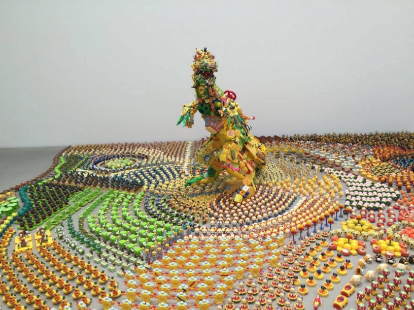
crazy cool installation from japanese artist hiroshi fuji featuring over 50,000 recycled toys.

love the rainbow of colors. so much detail in this - from the organization by color to the organization by shape and style. the more you look at these images the more impressive (and insane!) the installation feels.

http://geco.jp/
http://geco.jp/
http://geco.jp/
http://geco.jp/

more here.

via creative boom

LIBRO-TECA

i have mentioned my love of wes anderson (and symmetry and color) before. i've also mentioned my love of beautiful books. so, let's pull it all together now. take a look at this awesome five minute video of the books displayed in wes anderson movies, created by luis azevedo. the film also has a really interesting essay on the influence and symbolism of books in wes andersen films. here's a little peak:

"In the work of Wes Anderson, books and art in general have a strong connection with memory. The Royal Tenenbaums (2001) begins with a homonymous book, as does Fantastic Mr. Fox (2009). The Grand Budapest Hotel (2014) begins and ends with a book. Moonrise Kingdom (2012) ends with a painting of a place which no longer exists. These movies have a clear message: books preserve stories, for they exist within them and live on through them."

more here.

via swissmiss